

Why is a logo important?
"A picture is worth a thousand words.". This old saying probably referred to photos, but truth is, it definitely applies to your logo as well. Your logo is the shorthand of your company. With one look, you can establish a professional trust with your new and existing clients. A logo creates a lasting impression of your company. When someone thinks about your company, it is your logo they see in their mind's eye.
This is but a few very important things to remember about logos. Since your logo is the most essential and valuable asset in your branding arsenal, keep in mind to budget for a professional when hiring someone to design/re-design your logo, since a well designed logo will contribute business achievement, where an insufficient logo imply amateurishness and often put off potential customers.
This is but a few very important things to remember about logos. Since your logo is the most essential and valuable asset in your branding arsenal, keep in mind to budget for a professional when hiring someone to design/re-design your logo, since a well designed logo will contribute business achievement, where an insufficient logo imply amateurishness and often put off potential customers.
Key points of a well designed logo:
It should be unique:
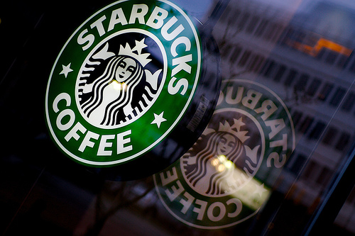
Part of a logo's job is that is should be recognizable. One of the best examples to illustrate this is most possibly the Nike swoosh, or the apple icon from Apple. As such, it is advisable to stay away from overused icons, like globes or arrows. After all, your logo does not need to say what you do; the Mercedes logo is not a car, Virgin Atlantic's logo has nothing to do with airplanes, and the Apple logo looks nothing like a MacBook or an IPhone.
Part of a logo's job is that is should be recognizable. One of the best examples to illustrate this is most possibly the Nike swoosh, or the apple icon from Apple. As such, it is advisable to stay away from overused icons, like globes or arrows. After all, your logo does not need to say what you do; the Mercedes logo is not a car, Virgin Atlantic's logo has nothing to do with airplanes, and the Apple logo looks nothing like a MacBook or an IPhone.
 |  |  |
That being said, there are a few other things you need to keep in mind as well:
It must be appropriate:
Your logo should mirror the image of your company. If you are a law firm, you cannot use a logo with a clown or a beach ball as an icon, it should be professional, with a color psychology that applies to your niche/target market.
It should be adaptable:
A logo should be simple enough that, when printed on a business card, it should make the same impact as when printed on a billboard. Your designer should make sure that your logo looks good in all sizes. It should also look good in gray scale or black and white. Especially if you make use of fax machines.
It should be timeless:
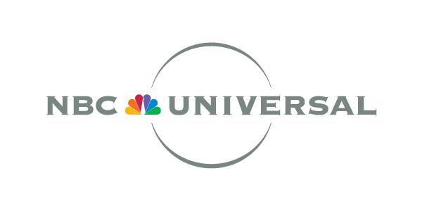
Sometimes, you get carried away with the design of your logo. You forget that, in a year on 2 year's time, your company might grow and change to fit into new trends and markets. By designing a timeless logo, you will ensure that you won't need a re-designed logo or an updated logo every 2 years. A good example of this is the I love NY logo, or the NBC Universal logo.
Your logo should mirror the image of your company. If you are a law firm, you cannot use a logo with a clown or a beach ball as an icon, it should be professional, with a color psychology that applies to your niche/target market.
It should be adaptable:
A logo should be simple enough that, when printed on a business card, it should make the same impact as when printed on a billboard. Your designer should make sure that your logo looks good in all sizes. It should also look good in gray scale or black and white. Especially if you make use of fax machines.
It should be timeless:
Sometimes, you get carried away with the design of your logo. You forget that, in a year on 2 year's time, your company might grow and change to fit into new trends and markets. By designing a timeless logo, you will ensure that you won't need a re-designed logo or an updated logo every 2 years. A good example of this is the I love NY logo, or the NBC Universal logo.
 |  |  |
So...how do I know if my logo is sufficient?
You might want to check out a few things:
- Does my logo look professional? Maybe you can ask a few friends, colleagues and family members for their honest opinions
- Is my logo appropriate? Consider your average client. What do they do? What istheir age? What is their sex? Why are they interested in your services? Then take a good look at your logo: Do you think your logo speaks to your average customer?
- Is my logo recognizable? Can you honestly say that your logo is recognizable?Would a new client to be able to remember your company name because they remembered how your logo look? Would they easily confuse your logo with that of another company?
- Does my logo look good in different sizes and in black and white? You have to consider how your logo will look printed on small items, printed in advertisements and/or billboards, when embroidered or printed onto shirts, how it will look on your website and email signatures and how will it look on a copied or faxed document?
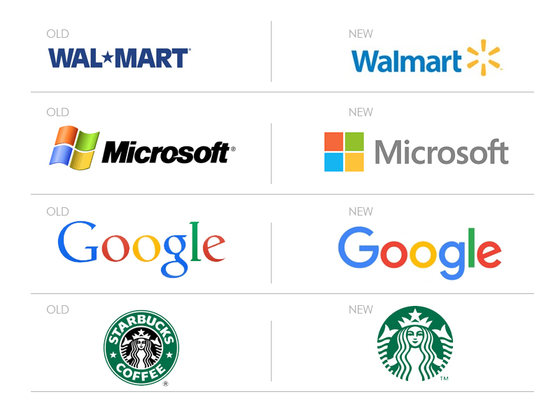
Some major companies recently updated their logos
If you are still not sure if your logo is sufficient, we will do an evaluation for you and make suggestions for changes to suit your company image. If you are interested in a consultation, feel free to Contact Us
 RSS Feed
